Table Editor
The following image depicts the node table editor interface.
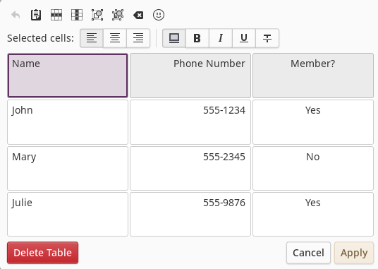
Interface
The table editor interface consists of 4 main areas.
Table Button Bar
The top-most row of buttons provide editing functions for the table. These buttons are described as follows (from left to right):
Undo
Clicking this button undoes the last table editing operation within the current table editing window which includes text changes, formatting and structural changes. Once the table editor interface is closed (with Cancel or Apply), the undo buffer is cleared.
Paste Table
If the clipboard contains tab-separated data copied from a spreadsheet or standard Markdown table text, the contents of the entire table will be replaced with the clipboard contents.
Row Actions
Clicking the Row Actions button displays a menu of functions that operate on the row containing the currently selected cell. Menu options include:
- Insert row above the current row
- Insert row below the current row
- Delete the current row
Column Actions
Clicking the Column Actions button displays a menu of functions that operate on the column containing the currently selected cell. Menu options include:
- Insert column before the current column
- Insert column after the current column
- Delete the current column
Merge Selection
If multiple cells are selected either by dragging across cells or shift-clicking two adjacent cells, clicking this button will merge the selected cells into a single cell. The new cell will cross two or more rows and/or columns.
Split Selection
If a merged cell is selected, clicking this button will break the merged cell back into separate cells.
Clear Cells
Clicking this button will clear all text within the currently selected cells.
Insert Emoji
Clicking the emoji button will display the emoji picker. Selecting an emoji will insert that emoji characters at the current insertion cursor.
Cell Button Bar
The second row of buttons primarily affect the current selected cells. The following is a description of each button (from left to right).
Column Justification
The first item in the button bar is a series of three mode buttons that determine how text is justified in the currently selected column. Justification options are: left, center or right.
Highlight Cells
This button toggles the highlight state of the currently selected cells. Highlighted cells will be displayed with a different background color than non-highlighted cells. This can be useful for depicting a header row, displaying even/odd rows, or just calling attention to a subgroup of cells in the table.
Bold Cells
This button toggles the bold state of the text of currently selected cells. Bold style will be applied to all text within the cell.
Italicize Cells
This button toggles the italicized state of the text of currently selected cells. Italicized style will be applied to all text within the cell.
Underline Cells
This button toggles the underlined state of the text of currently selected cells. Underlined style will be applied to all text within the cell.
Strike-through Cells
This button toggles the strike-through state of the text of currently selected cells. Strike-through style will be applied to all text within the cell.
Table Cells
This is the main editing area of the interface, displaying all table cells, their text, and the currently selected cell state. Selecting a single cell within the table will allow you to start immediately editing the text of the cell. You can select a rectangular range of cells by dragging out the selection or shift-clicking cells.
Table Editing Completion Buttons
The bottom row of buttons are labeled according to their function.
Delete Table
Removes the current table from the node and ends table editing mode.
Cancel
Ends table editing mode without applying any changes made within the table editor.
Apply
Ends table editing mode, applying any changes made within the table editor to the currently selected node.